Product & Brand Design
A wedding operating system, not a checklist or a website builder
- Company
- Inawo
- Period
- Apr 2022–Jun 2023
- Role
- Product & Brand Designer
Wedding planning is emotionally and logistically complex, and more so in a market where a wedding means large guest lists, multiple ceremonies and many stakeholders. Couples were coordinating all of it across spreadsheets, messaging apps, notes and vendors, which left the information fragmented and the overall progress invisible to the two people whose wedding it was.
The problem
The existing options failed in two opposite directions. Feature-heavy planning platforms overwhelmed people who were already stressed. Generic website builders produced something pretty with no planning or coordination behind it. Neither was built for the scale or the cultural expectations of a real Nigerian wedding.
The question I worked to was this: how might we design a single, intuitive platform that lets couples plan, track and present their wedding without adding cognitive load or setup complexity?
The hard part was that the obvious answer, more features, was the thing making the existing tools unusable.
Research
I reviewed the global wedding-planning platforms, looked at how couples were actually managing the work, and studied the patterns in the tools they had reached for instead: spreadsheets and group chats.
Four things came out of it. Couples valued knowing where they stood more than they valued customisation. Planning fatigue rose sharply when too many options appeared at once. They wanted structure but still needed room for personal expression. And almost every decision got revisited more than once, which made clarity and flexibility matter more than getting it right first time.
Together those pointed at a task-first product with progressive disclosure and a visible sense of momentum, rather than a comprehensive one.
The positioning call
The 2022 to 2023 market had growing demand for all-in-one wedding tools, but almost everything available was built for Western wedding norms and optimised for either planning or presentation, never both. That gap was the opportunity.
So Inawo was positioned as a wedding operating system rather than a checklist app or a website builder. That framing is what made the scope decisions afterwards straightforward: anything that did not help a couple know where they stood or move to the next phase was out.
What I designed
Three principles held the work together. Progress over completeness, so users always know where they stand. Reduced cognitive load, so complex workflows break into manageable steps. Intentional scope, so fewer things are executed well rather than everything covered thinly.
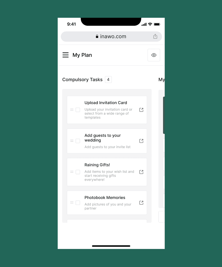
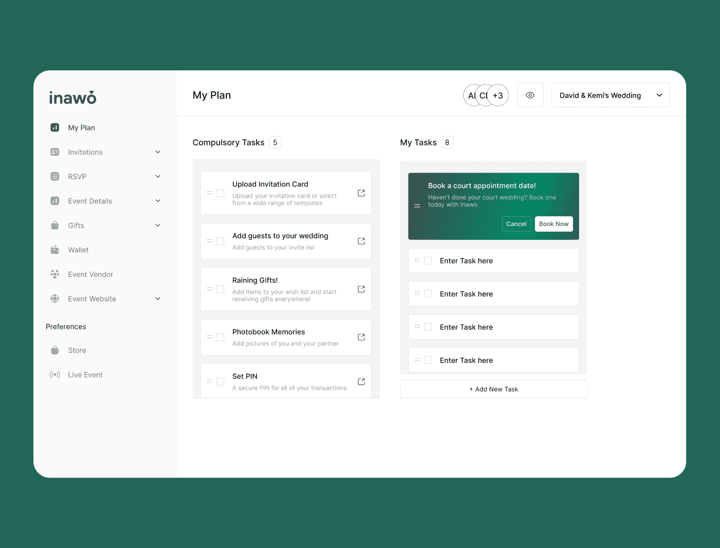
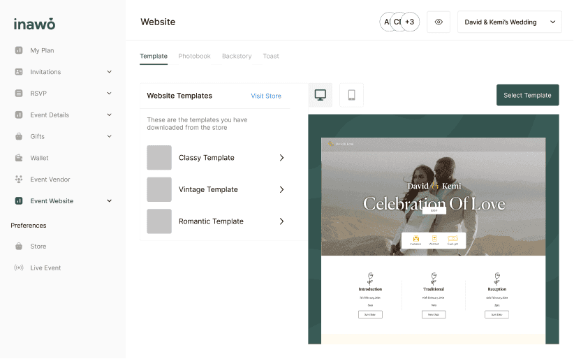
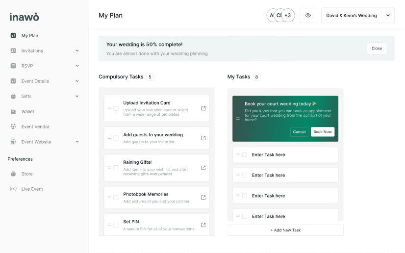
In practice that meant a centralised dashboard tracking planning progress, tasks organised by milestone against the real phases of a wedding rather than a flat checklist, a modular website builder trading unlimited customisation for speed, and progressive onboarding so a first-time user is never shown the whole system at once.
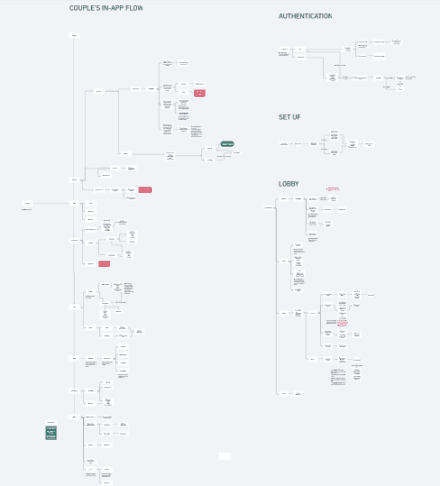
Flows were iterated in Figma and refined to hold up for both the initial setup and the repeated check-ins that make up most of the actual use.
What I took from it
The result was a single system where couples could manage tasks, track progress and build a wedding presence, and it showed how much constraint and prioritisation can do for usability when the context is emotionally high stakes.
Three things stayed with me. Early-stage products benefit disproportionately from scope control. Designing for emotional contexts takes empathy and restraint rather than more features. And strong UX often means refusing things with obvious short-term appeal and long-term friction.
It also sharpened how I work on complex multi-step flows, tie design decisions to market positioning, and operate inside the constraints of an early-stage team.