Platform / Search
Building the front door to a Business OS
- Company
- Mainstack
- Period
- Jul 2026
- Role
- Senior Product Designer
- Team
- Engineering, Product and QA
Mainstack is evolving into a Business OS, a single platform that brings together the products a creator or merchant needs to run their business: invoicing, bookings, hosted courses, communities, and more. That is the value of a Business OS, but it comes with a cost that shows up quietly as the platform grows: the more products you bring together, the more places there are to look for something.
The problem
By the time we started this work, a merchant trying to find a customer, check a transaction, or locate a product they had listed had to already know which section of Mainstack that information lived in. There was no single place to just ask. Global Search was built to be that place, the first foundational, cross-platform capability of V4, not tied to any one product.
Merchants could not find business information without knowing, in advance, which module it lived in.
That sounds like a small inconvenience until you watch someone actually do it. A merchant trying to confirm whether “Adaeze” paid her invoice has to guess: is that under Payments, Transactions, or Invoices? A merchant looking for the course they titled “Intro to Baking” has to remember it lives under Products, then navigate there, then scroll or filter. None of this is hard, individually. It is just friction, repeated dozens of times a week, for the people actively running their business through the platform.
This was invisible in demos, where you show one flow at a time. It only shows up when you watch someone try to actually run their business day to day, and realise how much of that time is spent navigating, not doing.
My role
I owned this end to end as the senior product designer driving search for Mainstack V4: framing the problem, defining what Phase 1 would and would not cover, designing the interaction model, and writing the PRD that Engineering, Product and QA built from. I worked closely with engineering throughout, particularly on scoping decisions that had real technical weight behind them, like how result pagination should behave and what “Products” actually means inside Mainstack's data model.
The opportunity
The instinct with a first version of search is to build the whole thing: every entity, a command palette, filters, saved searches. I pushed back on that early, deliberately. The story we told was not “we are adding search.” It was: as Mainstack becomes a Business OS, merchants need one consistent way to find information across the platform, without learning where everything lives.
That reframing mattered because it turned a feature request into platform infrastructure, and it gave me permission to say no to almost everything in the first version. Phase 1 needed to prove the pattern with the three things merchants look up constantly: Contacts, Transactions and Products. Everything else, communities, payment links, invoices, commands, natural language, got an explicit “not yet” instead of a vague “eventually.”
Decisions
Defining Products before anyone could misread it.
The word “Products” is ambiguous inside Mainstack. Say it to an engineer and they might assume digital downloads only. Say it to a merchant and it could mean anything they sell. I wrote an explicit definition into the PRD before a single line of the functional requirements: Products means every sellable offering, digital products, courses, sessions, bookings and webinars, and does not mean communities, payment links or invoices. Small thing, but it is the kind of ambiguity that turns into a scope argument three weeks into a sprint if nobody catches it early.
A modal with tabs, not three infinite lists.
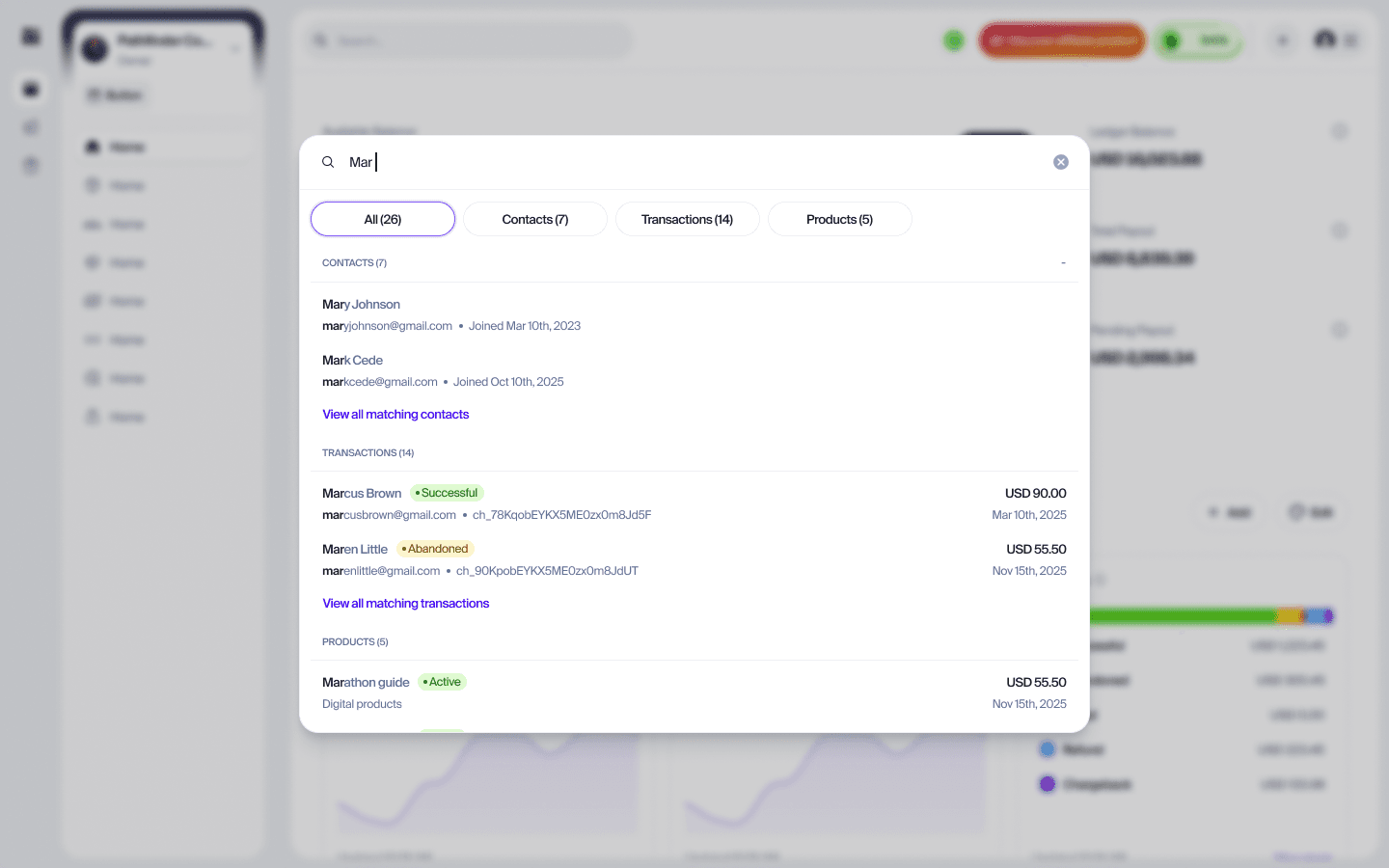
The results experience is a search modal with four tabs: All, Contacts, Transactions, Products, each labelled with a live count. The All tab is the fast path, a single scrollable view with all three categories stacked, capped low enough that all three stay visible at once. If a category has more than three matches, a “View all matching contacts” (or transactions, or products) link appears, and clicking it switches the modal to that category's own tab, where the full list scrolls infinitely. Clicking a tab directly does the same thing. Nothing here ever leaves the search modal to load a separate page.
Three results, not five.
The first draft of this spec capped each section at five results. I brought that down to three. The reasoning: a search modal earns its keep by being glanceable, all three categories visible at once, no scrolling needed to see that Contacts, Transactions and Products all have something for you. Five per section, times three sections, pushed the Products section off-screen on most laptop viewports for anything but the shortest queries, which defeats the entire point of showing three categories together. Three keeps the preview a preview. The escape hatch, the “View all” link into a dedicated tab, exists precisely for the cases where three is not enough.
Quick Actions as a safety net, not just a nicety.
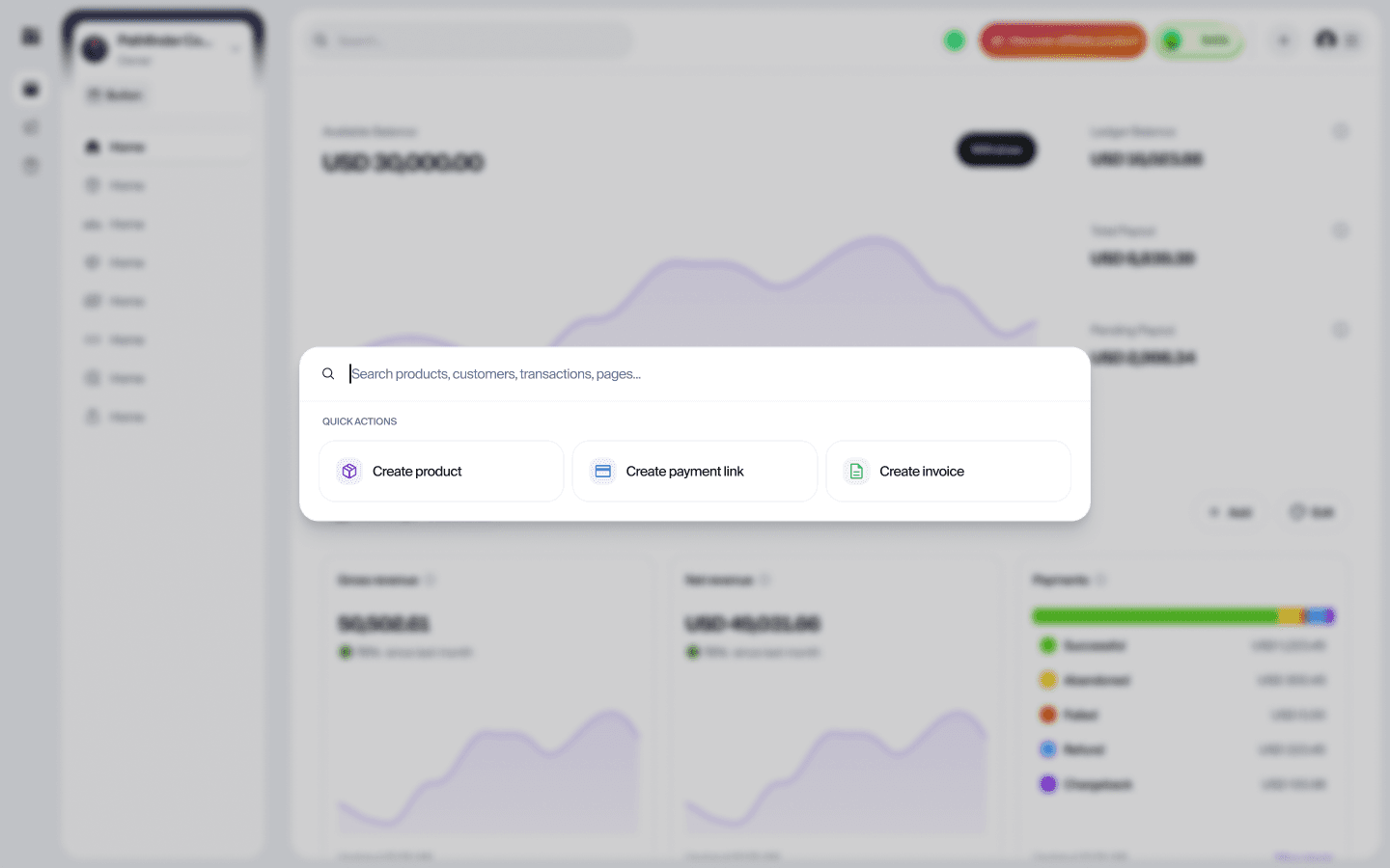
Before a merchant types anything, or after a query returns nothing, the modal shows three Quick Actions: Create product, Create payment link, Create invoice. This was not in the earliest scope. It came from a simple observation: an empty search box is a dead end, and a “no results found” message is worse, it tells a merchant the tool failed them. Quick Actions turn both of those moments into a fast path to something useful instead of a wall.
Hiding what does not match, instead of saying so.
Early in review, the spec called for every section to render even with zero matches, showing its own “No matching contacts” message, on the theory that a predictable layout beats a shifting one. I changed this. If a query only matches Contacts and Products, the Transactions section simply is not shown in the All tab. A panel full of “no matches here” messages for categories nobody asked about reads as noise, not helpfulness. The layout can flex; it does not need to lie about having something to show.
A failure that says so, not an empty state in disguise.
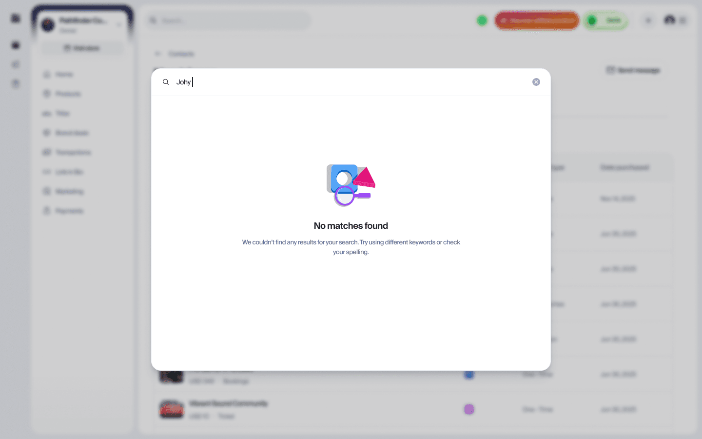
There are two ways a search comes back with nothing, and collapsing them into one screen is how an interface starts lying. If the request fails and the panel says No matches found, a merchant concludes the customer is not in their records, closes the modal, and walks away with a wrong answer they have no reason to doubt.
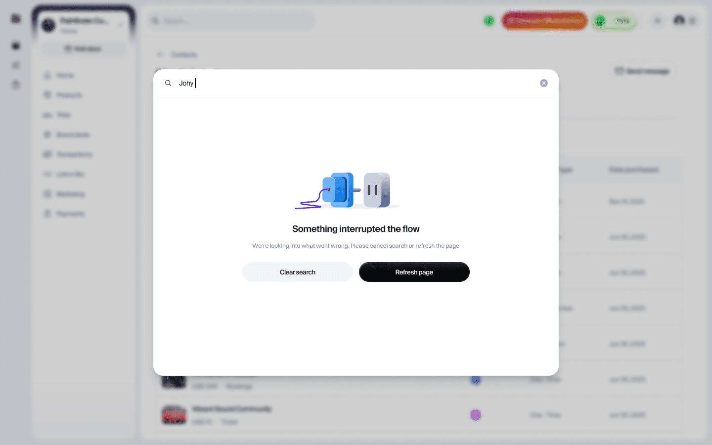
So the failure path got its own state. A different illustration, a heading that names what happened rather than what was not found, and, unlike the empty state, something to do about it: Clear search backs out, Refresh page retries. An empty result is information. A broken request is a question, and the interface should be the one asking it.
This is the same problem as the payment at Inawo that had gone through but not yet cleared looking identical to one that had failed. Different product, different year, same failure: two states the system could tell apart, rendered as one thing the person could not.
Where it actually got hard
The hardest part of this project was not any single screen, it was staying disciplined about what search would not do yet.
Every conversation about search pulls toward the command palette version: type anything, do anything, from anywhere. That is genuinely the long-term vision, and I believe in it. But building toward it in one shot would have meant shipping something half-finished across ten surfaces instead of something complete across three. I drew a hard non-goals list into the PRD itself, no communities, no payment links, no invoices, no commands, no filters, no AI-assisted query interpretation, in Phase 1, and defended it through several rounds of “can we just also add...” conversations. The keyboard shortcut is a good example: Cmd+K felt like an obvious Phase 1 addition until we were honest that it is a command-palette-shaped feature, and belongs with the rest of that work in Phase 3, not bolted onto a foundation release.
The other genuinely hard part was pagination, which sounds like a small technical detail until you realise it shapes the entire tab-switching interaction. I pushed against infinite scroll here, even though it is the obvious default for a browse-more pattern. Inside a modal, an open-ended scroll makes it easy to lose your place, and it fights with the keyboard navigation we had already committed to, arrow keys and scroll position drift apart the moment results load continuously underneath you. We landed on a simple Load more button instead: each batch of results is predictable, a merchant always knows roughly how much more there is, and it is a discrete, trackable action instead of a scroll-position trigger that is noisy to instrument. Less flashy than infinite scroll, more honest about what a search modal actually needs to do.
Outcome
Global Search shipped as the first foundational capability of Mainstack V4, in full Phase 1 scope, Contacts, Transactions and Products, searchable from anywhere in the platform, no longer contingent on a merchant remembering which module a piece of information lives in.
It is early days in production, so I am not going to dress this section up with numbers that do not exist yet. What I can say is that the metrics were not an afterthought: search adoption, search-to-result click rate, time to first result and zero-result rate were all defined in the PRD before launch, not chosen after the fact to fit a good-looking story. Zero-result rate in particular is the one I am watching closest, since a high rate this early would tell us merchants are searching for things outside Phase 1's scope, a direct, useful signal for what Phase 2 should prioritise first.
What is next
Phase 1 was deliberately narrow so Phase 2 and 3 have somewhere solid to build from. Phase 2 extends search to Invoices, Payment Links and likely Communities, and adds search history (the last five searches, scoped per account) to the pre-query state alongside Quick Actions. Phase 3 is the command palette: actions and commands executable directly from search, filters, saved searches, and the Cmd+K shortcut that got cut from this version for good reason. Getting the foundation right, tab structure, scope discipline, an empty state that never dead-ends, is what makes that roadmap buildable instead of aspirational.